Website Redesign
FoodieFanatic
#InformationArchitecture #WebUX/UI
Overview
Foodie Fanatic is a digital platform for all food-related resources. However, the current information structure lacks organization and is not expandable.
We redesigned the information architecture and web UX/UI to create a discoverable experience. The new designs supports users to create recipes with associated tags and discover related content in a intuitive way.
Role
UX/UI Designer, Graphic Designer
Besides contributing to the taxonomy, site map, and conducting card sort with participants, I mainly identified the personas in the research phase as well as created the wireframes and prototype on Figma.
Year
2020
Tools
Figma, Illustrator, Balsamiq, Slickplan, Optimal Workshop
Context
This is a school project I did in UW. The design prompt was based on a real website and we used their content and web structure as reference.
Foodie Fanatic is an online platform for all things food-related. While their main focus is recipes curated by the team and from individual creators, they also carry cooking-related products, including appliances, housewares, tools, and specialty ingredients on their website.
The objective of Foodie Fanatic is to become a one-stop for foodies to find everything they need to cook a delicious meal.
Problem
Losing users at the Revenue stage.
Although Foodie Fanatic offers a great variety of content, its crossover of a blog-content and a eCommerce website made their website difficult to use. Some issues we’ve identified include:
• Complicated Navigation:
The current information structure is heavily layered and difficult for users to navigate. Users get lost in the multi-layered sections and often feel unsure of the category terms.
• Hidden Content:
A lot of content, specially user-generated ones, is hidden within specific sections of the site that most users don’t visit. Low exposure of users’ creations discourages them to contribute on the platform; and poor content connection shortens the explore experience.
We reflected on Foodie Fanatic’s AARRR metric (acquisition, activation, revenue, retention, and referral) and set out to improve on Activation and Revenue.
Opportunity
How might we connect the dots?
Foodie Fanatic has all the food-related content already…the problem is, how can we organize this information in a way that makes sense to the audience and make the information space discoverable?
Design Process
User Research
The new experience should account for a variety of cooking skills and different information needs.
User Study
One of the insights we discovered through the interview process is the variety of cooking experiences in the Foodie Fanatic user group and how that calls for different information-accessing experiences.
Solution
An information space that is discoverable.
From the research we determined our top goals:
Reorganize content structure to make it easy for users to find information and navigate
Encourage users to explore available resources
To create a discoverable information space on top of what Foodie Fanatic already has, we curated our solution into two steps.
Reconstruct
By redesigning the information architecture of Foodie Fanatic’s content including their taxonomy and sitemap, we aim to organize the content to make it easy to navigate and scalable.
TAXONOMY
We created a four-level, 300+ terms, and 100+ relationships Navigation and Tagging Taxonomy as a basic structure for a food content webpage. Below is a snapshot of the navigation and tagging taxonomy for the products Foodie Fanatic carries.
The full taxonomy can be found here.
SITEMAP
Based on the user study, we proposed a new navigation structure from the navigation taxonomy to better serve users and promote the business.
We used Slickplan to design the site map with a hierarchical structure, but also show annotations and/or horizontal relationships between one section and another.
Validating our structure with CARD SORTING
To test out the new information architecture and understand Foodie Fanatic users' expectations, we conducted a card sort to test our navigation categories and tagging taxonomy. This helps us to see how users think about where information goes and what they think about the current labels.
We conduct the card sort with the Optimal Workshop online suite. In total, 10 people have filled out the survey. We made alternations to the taxonomy based on the feedback on user testing.
2. Reconnect
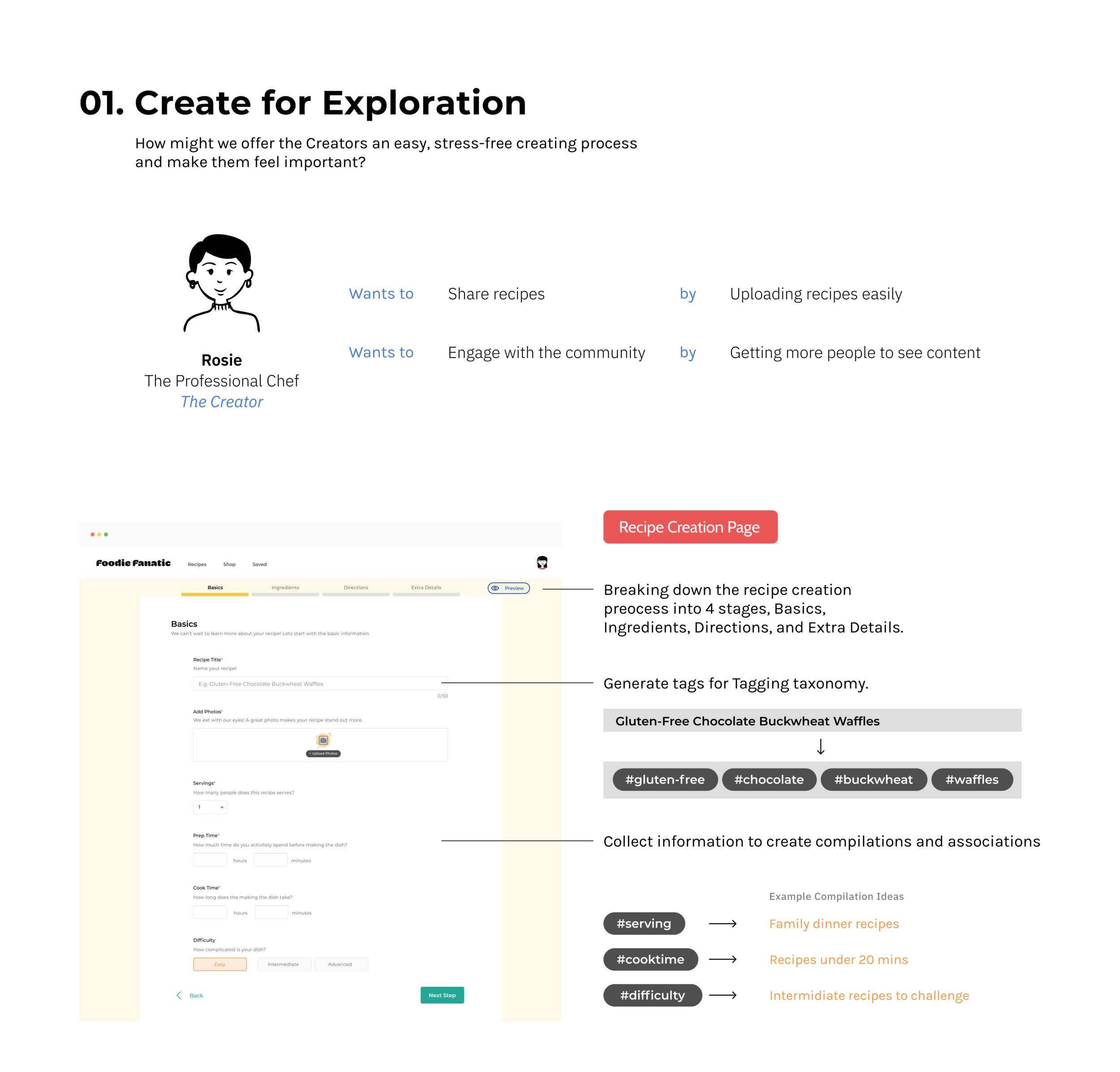
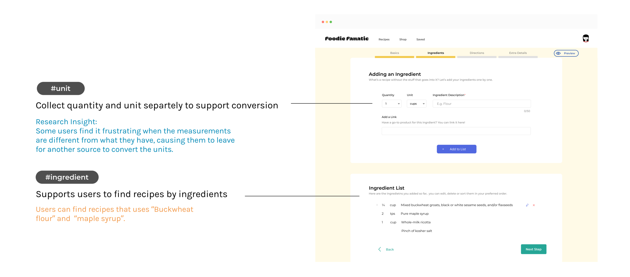
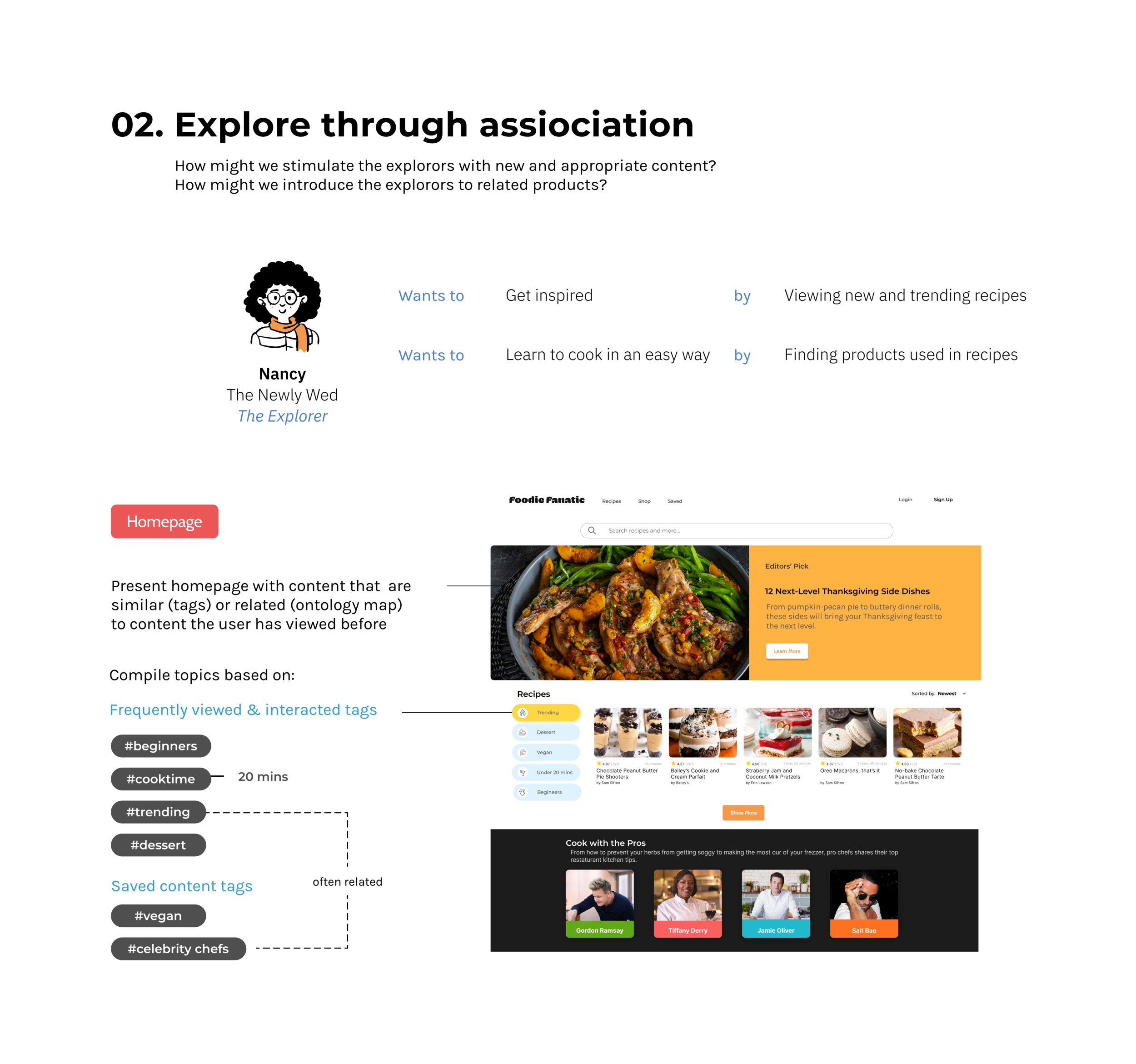
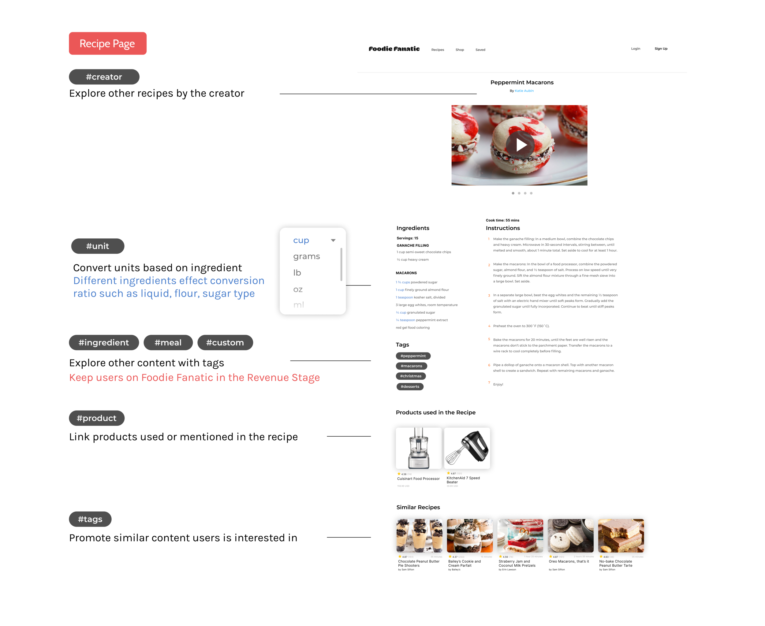
After reorganizing the content, it’s time to think about how to connect the information seamlessly from the users’ end. The goal is to make it intuitive for users to jump from content to content through association and branch out the discovery journey.
Website UX Design
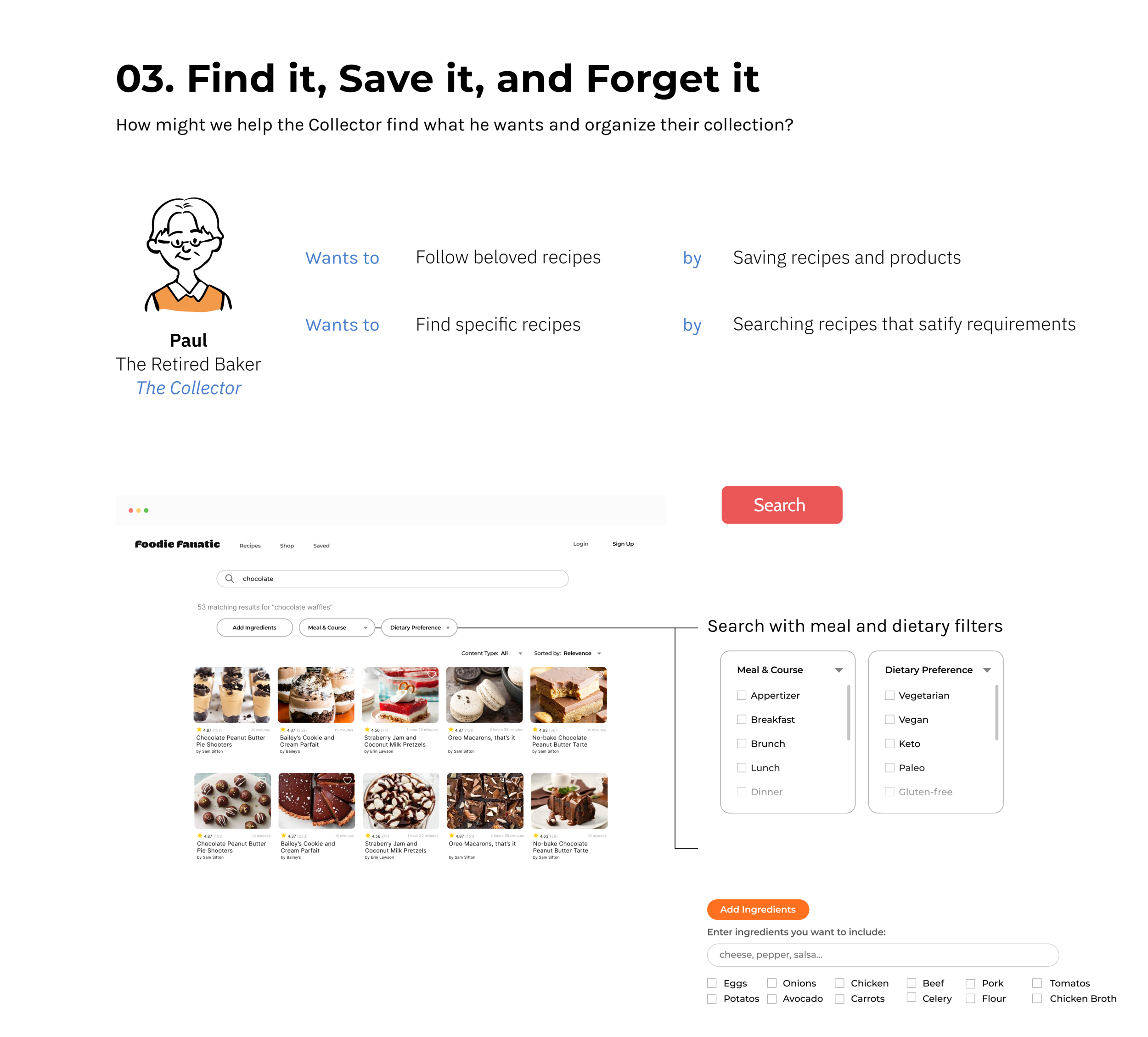
We reimagined the new Foodie Fanatic core experience for the Creators, Explorers, and Collectors.


Reflection
Think outside the visual box.
Under the all-powerful modern technology, it has become a habit for me to go straight into redesigning user interactions or search for tech solutions when I am trying to improve the digital experience. This was a great opportunity to study the problem from an information architecture angle and I learned that a logically organized information space is as important as an intuitive interface.
This project was a reminder to me that my job as a designer is to make the best experience with what is available and that solutions are not limited to visuals.


